
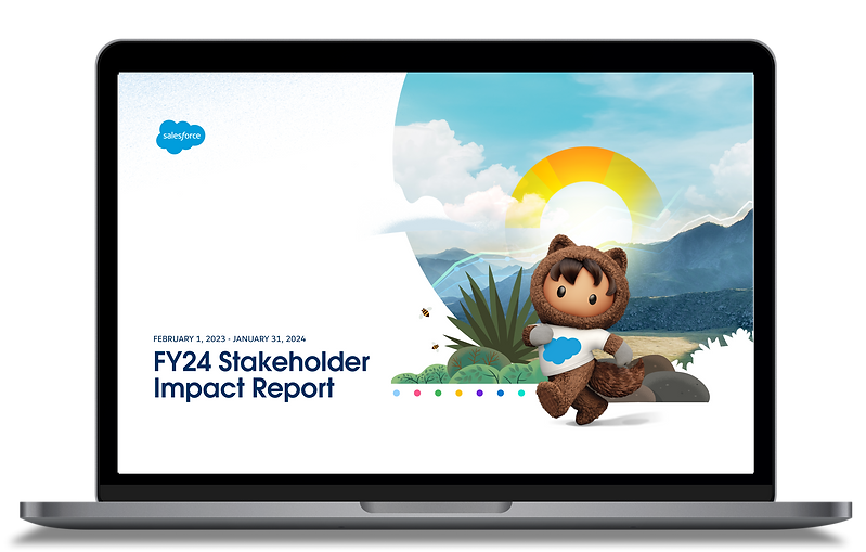
Salesforce Stakeholder Impact Report
Salesforce's annual stakeholder report covers six chapters, 67 pages, and a year's worth of ESG commitments. I designed the complete visual system — section covers, custom data visualizations, and editorial layouts — so a dense document felt like something people actually wanted to open.
Each chapter has its own color identity and layout logic, while sharing a framework that holds it all together. FY24 was year two — I'd designed the FY23 digital experience first, which meant I knew exactly where the design needed to go further.
Data visualization
Editorial layout
ESG report design
Design systems

THE CHALLENGE
One Report. Six Different Stories.
Salesforce's stakeholder report covers greenhouse gas emissions, global equality data, AI ethics, philanthropy, and governance — all in one document, for an audience of investors, employees, partners, and the public. Each chapter has different data density, visual requirements, and an emotional register. The challenge wasn't making it look good. It was making all six chapters feel like they belonged to the same document.
THE SYSTEM
Six Identities. One Framework.
Each chapter got its own color — Planet is deep green, People is crimson, Technology is purple — so readers feel the shift between sections without needing to read the header. But every chapter shares the same grid, type system, and component logic. Nothing was rebuilt from scratch; everything was adapted.
The Salesforce mascot, Astro, appears throughout — but never generically. Each chapter gets a contextually themed version: Astro holding a plant for Planet, sitting in an office chair for Technology. It's a small detail that signals intent across 67 pages.
Color identity per chapter
Contextual illustration
Shared grid and type system


KEY DECISION
Navigation as Orientation
In a 67-page document, readers get lost. The solution wasn't a better table of contents — it was building navigation into every single page. A global top nav tracks which chapter you're in. A sub-nav within each chapter shows where you are within that section. At any point, you know exactly where you are and where you can go.
That two-level system is what makes the document feel navigable, not just long.
Global chapter nav on every spread
Sub-section nav within each chapter
Color-coded active state
OUTCOMES
Year Two — Knowing What the Format Demands
67 pgs
across 6 chapters
2nd
year designing this report for Salesforce
Built on the FY23 digital experience — knowing what worked, what didn't scale, and what the PDF format demanded that a website never had to think about.
Design tradeoff
System over bespoke. Every chapter could have had a completely custom design language — but that would have made 67 pages feel like 6 disconnected documents. A shared visual framework with per-chapter identity was the bet. The interactions were completed by the creative director after my departure; the visual system and layout architecture are entirely mine.


