Grammarly
Business
Click-Through
Product Tour
As a Visual Designer, I developed the visual system and narrative flow for Grammarly’s interactive product tour.
The goal was to transform scattered sales and product messaging into a clear, story-driven SaaS experience — designed to scale across use cases while helping teams understand key features and communication workflows.
Enterprise SaaS
End-to-end product design
B2B Product
Interaction design

THE CHALLENGE
High Context, Low Clarity
Enterprise buyers were being asked to commit to a demo before they understood how Grammarly Business actually worked. Sales relied on static decks and live calls to explain features — creating friction, inconsistency, and a bottleneck between interest and adoption.

BEFORE: EXPLANATION


AFTER: EXPERIENCE


↗ Hover the product visual to see the interaction
KEY INSIGHT
Guidance Beats Documentation
The problem wasn't missing information — it was that guidance lived outside the product. Users had to leave their workflow to learn the tool they were trying to use inside it.
The opportunity was to bring guidance into the product itself: contextual, embedded, and triggered by what users were actually doing.
Context over abstraction
Workflows over isolated features
Guidance over explanation
SYSTEM DESIGN
One Component Kit. Every Tour.
The system was built on a shared component library — step widgets, clickable areas, and timeline scrubbers — each with consistent states, behaviors, and interaction patterns across every tour. Built to be contextual, not instructional. Embedded, not external.
New feature tours didn't need new patterns. They needed a place to plug in.
Modular
Browsable
Accessible


THE SOLUTION
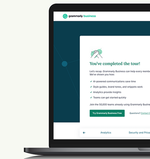
A Context-Aware In-Product Guidance System
I designed a reusable tour framework that surfaced feature guidance at the moment of use — triggered by user intent, not a linear onboarding checklist.
OUTCOMES
Shipped at Scale. Built to Last.
6
Product Features
50,000+
Teams onboarded
Reduced reliance on live demos and sales-assisted explanation. The shared framework was reused across product and marketing without redesign.
Design tradeoff
Modular over bespoke. A custom tour might look sharper for one feature, but the kit had to live for years and ship on someone else's deadline. Speed and consistency beat polish per surface.