The RoomPlace
UI Redesign
As the visual designer on The RoomPlace website revamp, I partnered closely with the Art Director to modernize the e-commerce experience — refreshing the visual language, tightening the hierarchy, and building a more cohesive shopping journey from homepage to checkout.
Work type
Retail e-commerce · Website rebrand · Visual systems
Focus
Brand translation, UI cohesion, shopping experience clarity
Contribution
Visual design, UI design, component system
THE BRIEF
A Furniture Brand That Felt Like a Catalog
The RoomPlace had the product. What it didn't have was a site that made you want to stay. Pages felt inconsistent, imagery was underused, and there was no clear visual language tying the experience together.
The ask: redesign the homepage, category pages, and PDP to feel more premium — and build them in a way that can flex with seasonal campaigns without falling apart.


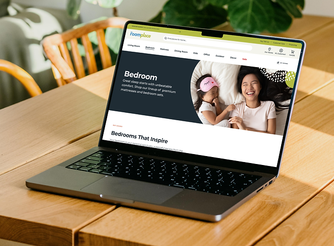
THE REDESIGN
A Site Worth Staying In
The redesign touched every major surface — homepage, category pages, and PDP. The visual direction moved away from dense, catalog-style layouts toward full-bleed imagery, clear hierarchy, and a more editorial feel. Typography got sharper, CTAs got more intentional, and the grid was rebuilt to handle high-volume browsing without feeling overwhelming.
SHOP THE ROOM
The Room Is the Product
Furniture is hard to shop for in isolation. The "Shop the Room" feature lets customers click directly into a styled room photo — each hotspot reveals the product, price, and a path to purchase. Instead of hunting through category pages, the room does the selling. I designed the hotspot interaction, the product card reveal, and the thumbnail gallery that lets shoppers move between room styles without losing context.
Design Tradeoff:
The challenge was keeping the interaction lightweight enough not to interrupt the browsing flow. Too many hotspots and it feels cluttered — too few and it loses utility. The final version strikes a balance: three to four anchor products per room, with a clear path to see everything else.


↗ Hover the product visual to see the interaction
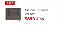
PRODUCT CARD

COLLECTION CARD

PARTNER CARD

THE COMPONENT SYSTEM
Cards That Do Different Jobs
The redesign needed a component library that could handle a lot — standard product browsing, curated collections, partner brands, and promotional moments. Each card type was designed with its own visual logic while staying inside the same system: consistent spacing, type hierarchy, and interaction patterns, regardless of what it was selling.
Design Tradeoff:
The partner card (Purple Mattress) uses a dark background — a deliberate exception to the site's light-and-airy direction. It needed to feel like a brand partnership, not just another product. Making room for that exception without breaking the system was the design problem worth solving.
THE WORK
The redesign touched every surface that mattered — from the first scroll to the checkout screen. The RoomPlace has since closed, but the work stands on its own.


