
Salesforce
Trailhead Coach Authenticated
Website Redesign
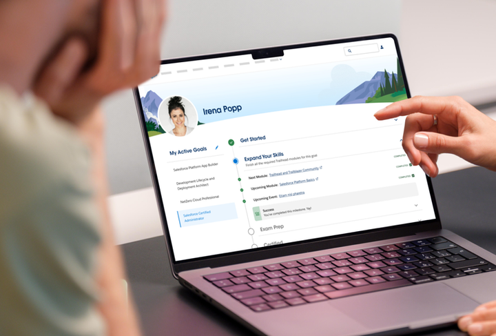
Trailhead's authenticated dashboard had the right data but the wrong story. Scattered goals, flat progress tracking, and no clear next step left users informed but not guided.
Enterprise SaaS
Interaction design
Dashboard design
Information hierarchy
CHALLENGE
Logged in. Now what?
The platform existed. Users were inside it. But the experience asked too much of them — too many places to look, too little sense of where they stood or what to do next. The Military Benefits Center, the Talent Alliance, and the goal-tracking tools — each felt like its own island. Nothing pulled the experience into a coherent whole.

BEFORE: NO CLEAR PATH

AFTER:AFTER: GUIDED
THE REDESIGN
From dashboard to destination
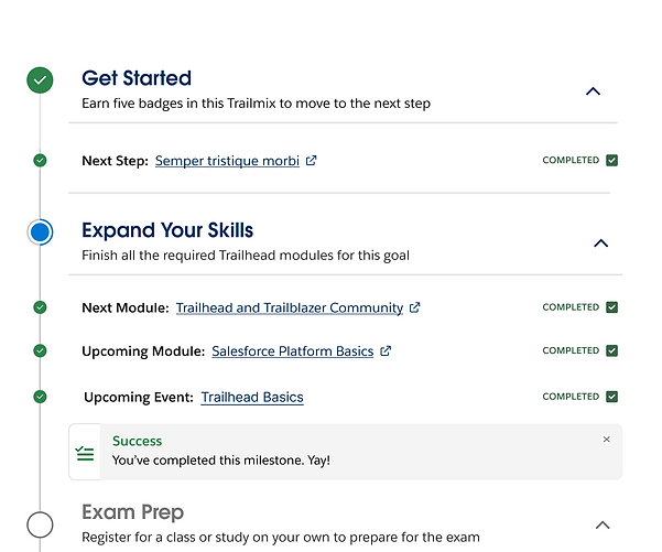
The original experience was organized around platform features. The redesign is organized around the user's goal — where am I, and what do I do next? The accordion progress system, simplified nav, and goal-first layout replaced a page that showed everything with one that showed what mattered.
BUILT TO SCALE
One system. Every page.
Five pages. One system. Cards, headers, CTAs, mascot moments — all designed once and extended without rework. New pages didn't require new thinking. They required the right pieces in the right order.

NOT STARTED

ACTIVE
COMPLETED

EXTENDED, NOT REPEATED
The system did the work.
When the Talent Alliance needed its own authenticated experience, the component library already had what it needed. No redesign. No patching. The system extended cleanly into new territory and stayed consistent without anyone having to enforce it.
OUTCOMES
From Scattered to Guided
It launched. It worked. The team loved it.
6
Authenticated
experiences
designed
2
Breakpoints per experience
(desktop + mobile)
+1
Engagement extended: client returned to expand the progress system
Design tradeoff
The accordion hid information behind a click. The bet was that one clear next step beats showing everything at once. It was the right call. But it wasn't a given.


