Grammarly
Business
Click-Through
Product Tour
As a Visual Designer, I developed the visual system and narrative flow for Grammarly’s interactive product tour.
The goal was to transform scattered sales and product messaging into a clear, story-driven SaaS experience — designed to scale across use cases while helping teams understand key features and communication workflows.
Work type
Enterprise SaaS · Product tour · UX + visual design
Focus
Narrative UX, visual systems, information design
Contribution
UX strategy, visual design, system articulation


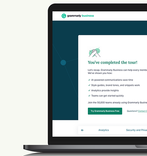
↗ Hover the product visual to see the interaction
KEY INSIGHT
The Best Demo Feels Like
Real Work
Users don’t need more feature explanations—they need to see how the product fits into the work they already do.
So instead of a feature checklist, I built believable in-product moments — guiding users through real workflows where Grammarly's value shows up naturally, not in isolation.
Designed for
Context over abstraction · Guidance over explanation · Workflows over isolated features
THE BUILD
One kit. Every tour.
Users don’t need more feature explanations—they need to see how the product fits into the work they already do.
So instead of a feature checklist, I built believable in-product moments — guiding users through real workflows where Grammarly's value shows up naturally, not in isolation.
Design decisions
Modular · Browsable · Accessible


THE SYSTEM
Same pattern, five tours.
AI Communication Assistant, Brand Tones, Style Guides, Snippets — each feature got its own tour, built from the same kit. The same interaction model that guided someone through writing assistance guided someone else through snippet creation.
Designed for
Context over abstraction · Guidance over explanation · Workflows over isolated features
THE OUTCOME
~70%
faster tour design time once the kit shipped
5
feature tours powered by one shared system
AI Communication Assistant, Brand Tones, Style Guides, Snippets, Analytics — all running on the same patterns. No reinventing the wheel for every feature, no design debt piling up as the product grew.
Design tradeoff
Modular over bespoke. A custom tour might look sharper for one feature, but the kit had to live for years and ship on someone else's deadline. Speed and consistency beat polish per surface.